Posts

Showing posts from April, 2016

The Lost Art of Letter Writing

Image
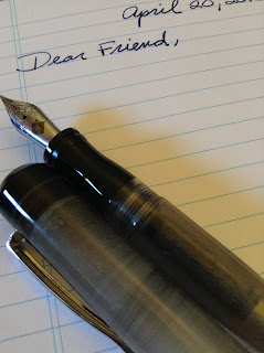
by Tony Thomas It seems that letter writing has become something of a lost art. E-mail is ubiquitous. Cursive writing, arcane. However, there are some great reasons to write letters. Here are some I came up with: 1) Letters are personal: Unlike impersonal (and sometimes annoying) e-mail, letters add a personal touch that cannot be duplicated. 2) Letters are tangible: They can be held and folded. They can be stored and re-read. And, if kept out of direct sunlight and if archival paper is used, they can even be read by future generations. 3) Writing is therapeutic: I derive a great deal of comfort and enjoyment from writing in longhand. My thoughts flow naturally and easily. It is relaxing and mentally stimulating. I would say it is even therapeutic. 4) They will get read: Everyone's e-mail box is stuffed and every e-mail is just one button push from oblivion. How many times have you asked: "Did you get my e-mail"? By contrast, most people are pretty mail-star

Karas Kustoms "Ink" Fountain Pen Review

Image
by Tony Thomas I have been an admirer of Karas Kustoms pens for a while now.  In fact, I purchased a few of their rollerball pens previously (the Render K and Bolt in aluminum) to house the ultra-fine Japanese gel refills from Pilot and Uni that I love to use. Of course, I prefer to use fountain pens whenever I can, but as you probably know, ultra-fine fountain pen nibs are not a joy to write with. Plus, there are times when rollerballs are preferable. If you don't know anything about Karas Kustoms, they are a CNC machine shop located in Arizona that decided to get into the pen business. They achieved their initial visibility through successful Kickstarter campaigns targeted at the burgeoning EDC (everyday carry) crowd.  What the company does is machine the pens they sell out of metals such as aluminum, brass, and copper. They do this on a CNC (Computer Numerical Control) lathe and then finish the pens by hand. If you would like to see how this is done, check out this You Tube vide

J. Herbin Rouge Hematite Review

Image
by Tony Thomas This is my second review of the J. Herbin 1670 collection of inks.  Up next is Rouge Hematite. For those who missed the last installment: "The 1670 Collection celebrates the rich life and adventures of J. Herbin, an enterprising French sailor of the mid-17th century. He made a number of voyages to India, collecting ingredients and formulas for his sealing wax and inks. He began making pen inks in his Paris workshop beginning in 1700 with the ' Ink of Ships ' and the ' Jewel of Inks .' Today, Herbin inks are widely used and internationally renown." J. Herbin Rouge Hematite is a beautiful, rich, shade of red.  It is saturated, but not nearly as dense as the Emerald of Chivor ink that I reviewed previously.  Again, I used my Conklin Duragraph with a 1.1 stub for the test.  The flow is excellent and the dry time is reasonable on Rhodia the 80gsm paper that I used.  I did not notice any significant shading with this ink.  It was a pleasure to write w

Jet Pens Chibi 2 Pocket Pen

Image
by Tony Thomas While filling up my shopping cart at Jet Pens , I decided to pick up a few of their Chibi 2 pocket fountain pens.  At less than $3 each, the price was right.  Plus, I noticed that they have received good reviews on their web site. After testing it out, I have concluded that it is a great little pen.  It has a smooth IPG fine nib, it posts (but not all that securely) and is comfortable to write with.  It comes with a black cartridge and accepts a Monteverde converter (which, sadly, costs almost as much as the pen).  I have decided to stick with cartridges and re-fill them when they run out. The Chibi 2 is a great snap-cap fountain pen to carry with you in your pocket or purse or to give away to people who would like to see what it is like to write with a fountain pen.   At $2.99, you really can't go wrong! For more information:  http://www.jetpens.com/JetPens-Chibi-2-Mini-Fountain-Pen-Fine-Nib/pd/14752 Chibi 2 next to Kaweco Sport and Rosetta Napoleon Cap, Section and

J. Herbin Emerald of Chivor Review

Image
by Tony Thomas I received a nice box from Exaclair, the U. S. distributor for J. Herbin containing the four 1670 Anniversary Edition inks. For those of you who have been out of touch for a while, J. Herbin 1670 is one of the most sought after ink collections currently available. For a bit of background, from the J. Herbin website: "The 1670 Collection celebrates the rich life and adventures of J. Herbin, an enterprising French sailor of the mid-17th century. He made a number of voyages to India, collecting ingredients and formulas for his sealing wax and inks. He began making pen inks in his Paris workshop beginning in 1700 with the ' Ink of Ships ' and the ' Jewel of Inks .' Today, Herbin inks are widely used and internationally renown." When I opened each individual box, I was quite impressed with the bottles and the elegant metallic cord and wax seal attached to each one -- an extremely creative and elegant design. At a bit over $25 a bottle retail for 50 m